About Kenshoo
Kenshoo is a SaaS Marketing platform that helps clients efficiently and effectively manage their search engine and social marketing campaigns across the major online publishers (Google, Facebook, Instagram, Yahoo!).
Overview
An earlier round of testing showed a critical error with a key graph in the new portfolio creation flow. With just two weeks available, we didn’t know if we’d be able to test and deliver a new design to stay on our development timeline.
I designed a triangulation based study comprised of a cognitive walkthrough, followed by a task-based usability test, and then finished by a preference test. First round of testing results showed that both designs had critical flaws. I prototyped and tested a third graph that incorporated the best and addressed the challenges of the previous designs.
The third design resulted in higher comprehension in cognitive walkthroughs as well as increased success rates in usability tests. Furthermore, participants rated the design higher in perceived intuitiveness (8.4/10).
objectives
Identify and address the challenges affecting the usability of each design.
Identify, if possible, the “winning” design
Incorporate usability findings into a new design that is intuitive, avoids errors, and shareable.
Skills
Cognitive Walkthrough
Usability Test
Preference Test
UX Design
Rapid Prototyping
Team
User Researcher (me)
UX Designer (me)
Visual Designer
Product Manager
UX Lead
Timeline
2 Weeks
a lil’ BACKGROUND
Kenshoo has a forecasting tool that has historically been designed and built by some of the smartest people at the company--the research group. They’re super smart people working on our state-of-the-art algorithms. They Cost their day talking about Bayesian statistics and modeling, covariants, regression analysis, and indices. They’re the type of people you want on your side--especially when you’re building out a successful marketing platform.
One of Kenshoo’s most powerful tools--Halogen--was the research team’s birth child, allowing our clients to perform forecasting based off of historical performance, seasonality, and external events. While those clients that were using Halogen were seeing major results (20% time savings and increased revenue by 53% with budget increases of 36%). All of the success was being overshadowed by the poor user experience and inability to read and interpret the simplest of questions: “if I spend $X, what can I expect in return.” Almost every interaction with the tool required one of our research teams to intervene and guide the clients on how to “correctly” use the tool.
Needless to say: this approach was unsustainable and costly. So together with the Product and research teams, client design partners, and internal teammates, the UX team set out to redesign the user experience to simply and beautifully illustrate the power of Halogen’s forecasting. Although, I’d love to tell you about all the fascinating design work involved in that redesign, this is a case study and not a novella. ;-)

the GOALS
Like with every research project, it’s best to start with outlining the goals and objectives of the research--what are our assumptions, what do we believe to be true, and above all, what is it that defines success for the design.
We landed on three main goals in order of priority:
Comprehension is King. Can the person understand what the graph is telling them and use the graph to derive the optimal settings without confusion?
Error avoidance. Which version of the graph will help avoid common “errors” or pitfalls experienced by clients by setting an unrealistic target?
Shareable. The graph will almost always be shared internally by our users to gain permissions and sign off prior to moving forward with the recommendation. Is the graph “screen-shot-able” and easily understood without much need for supplementary information?
There were other secondary goals for the research such as: finding where people will look first, tracking their visual path in reading the graph (where did they look first? second?), understanding where they might click or hover to denote desired interaction patterns, etc. But for the purpose of this micro-test: we focused on the main goals above all others to deem success.
The Contenders
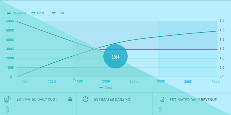
The O.G. (Original Graph)
The O.G. (Original Graph) was a bit traditional in nature—opting for triple axes and double lines to show the inverse relationship of Cost to ROI and highly dependent on interaction to decipher his meaning.
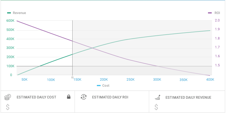
The NGTOB
The new graph on the block (NGTOB) took a simpler approach—focusing just on one line; however, in order to do this and still show the inverse relationship of ROI to Cost, the ROI axis on the right was inverted (descending from bottom to top rather than ascending).

The Test
In order to test the goals, we decided on a cognitive walkthrough of each of the graphs that included a series of tasks whereby the participant needed to use the graph to fill in the missing information. Since the emphasis was not on interaction and instead just the graph itself, we used static screenshots in a basic powerpoint to walk the various participants through the exercise. To counter order bias, we randomized the order in which the graphs appeared to the different participants.
Here’s just a few of the questions that we outlined in the discussion guide:
Prescreening questions:
Do you currently use Halogen?
If so:
What do you think of the tool?
How are you using it today?
When was the last time that you issued a forecast/plan?
If not:
Do you know what Halogen is?
Have you used halogen before?
How are you doing forecasting today?
Cognitive Walkthrough Questions:
What is this graph showing you?
What do the shaded areas represent?
What do you think the green line represents?
In one: what do you think purple line represents
What does the right axis represent?
What does the bottom axis represent?
What does the left axis represent?
What do you think the grey/colored areas are (depending on the graph being displayed)?
Tasks Walkthrough (done on each graph)
Dual Line Concept:
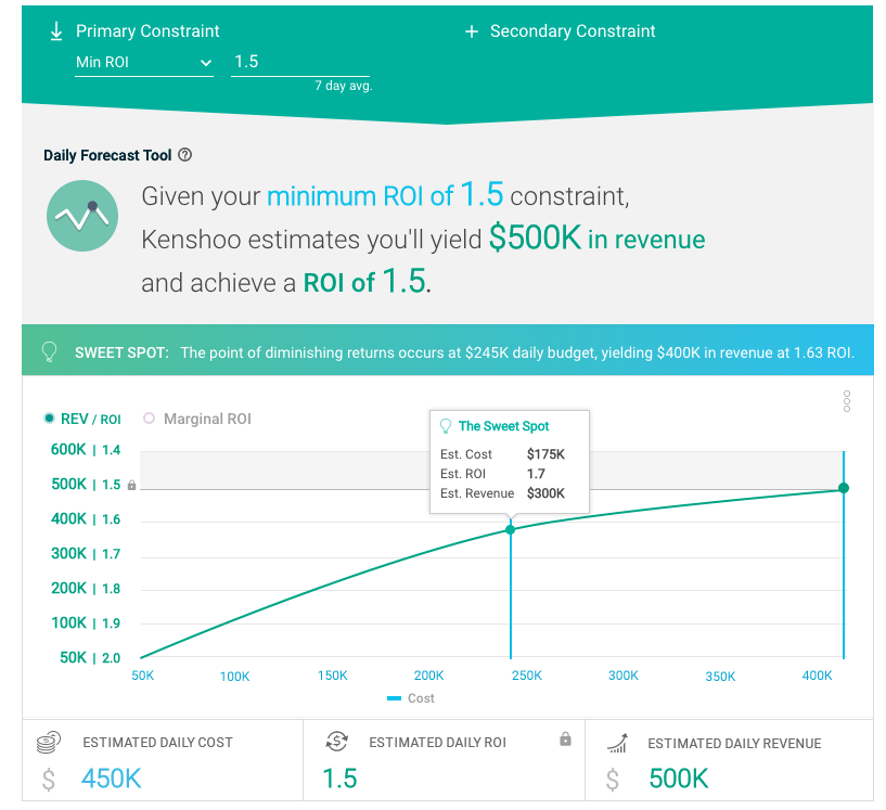
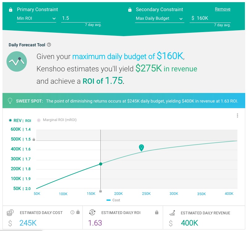
You have just went through the new KPO porfolio set up flow, and you've configured a constraint of achieving a minimum ROI of 1.5 and another constraint of a maximum daily budget of $140K. Using the graph, tell me what is your maximum Revenue you can achieve given those constraints?
On a scale of 1(completely confusing) to 10 (super intuitive), how would you rate the overall intuitiveness of the graph?
Single Line Concept:
You have just went through the new KPO porfolio set up flow, and you've configured a constraint of achieving a minimum ROI of 1.7 and another constraint of a maximum daily budget of $300K. Using the graph, tell me what is your maximum Revenue you can achieve given those constraints?
On a scale of 1(completely confusing) to 10 (super intuitive), how would you rate the overall intuitiveness of the graph?
Wrap-up:
How might you change the graph to be clearer or more intuitive?
Do you think the graphs were showing you the same information? Why/Why not?
Of the two graphs, which do you think was clearer to you in it's meaning? Which do you prefer?
the findings
Plot twist! Neither graph “won.” Instead it was pointed out that both graphs had their shortcomings. While the O.G. scored the lowest on “perceived” intuitiveness by participants at 5.2 (eek!), the NGTOB scored only marginally better at 6.5. Both scores were not good enough to go to production.
Sidenote on intuitive ranking and “scores”: intuitive ranking isn’t actually a quantitative metric (appearances are deceiving). It’s a qualitative metric that is aimed at providing a clear indication of preference, helping uncover additional ideas, and pinpoint biases. As with any qualitative point, you have to take the feedback with a “grain of salt” and plenty of follow up questions. The idea behind asking participants to do the ranking is to highlight the following:
Clearly identify the disparity between the tested concepts
Start a discussion on what would “make it a 10” (people can generally reflect and give good suggestions after they’ve given a rating)
Uncover any additional biases not in the rating but in their explanation of why they may have given that score.
Clearly understand the individual and group preference
Identify any outliers in the study
I compiled all the findings for each concept by participant using the rainbow spreadsheet methodology for compiling and highlighting usability testing feedback.

Back to the drawing board
I reviewed the findings with my fellow design team and quickly prototyped a third iteration that addressed the pros & cons of each of the designs. The “Goldie Locks Graph” factored in the simplicity of the single line graph while addressing the reading issues caused by three axes, minimizing the confusion of the descending axis, and highlighting the inverted relationship.
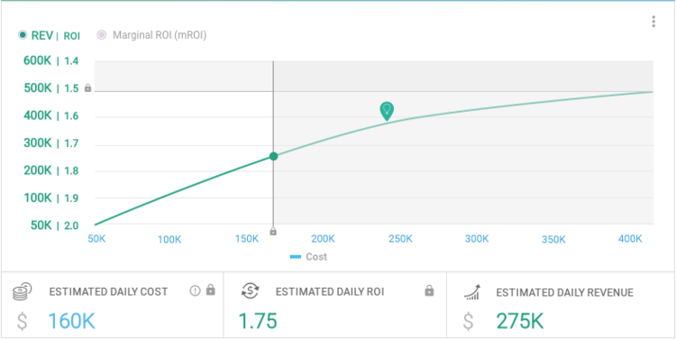
The goldie locks graph included the simplicity of the single line graph while introducing a dual value axis showing the inverted relationship of Revenue to ROI.
Best of all, participants validated the combined approach and rated the new concept significantly higher in terms of perceived intuitiveness with a score of 8.4.

The Outcomes & Deliverables
With the testing and validations done, I presented the full findings to the Lead PM and Engineer on the project as well as my fellow designers. The presentation was topline reviewing the methodology, the test results and the feedback on the various versions. Furthermore, I presented the UX for a final solution in the form of an interactive prototype to show rollover interactions and different states with various constraint scenarios.
A REflection…
At the end of the day, we tested, measured, and learned—embracing and embodying the best of lean and agile principles. The most important lesson we learned was to never hold dear your designs. Design is in its nature iterative and evolutionary. We must as designers test our own designs so that we can improve not only our own practice but our end-users experience.
The Good
A quick less than a 2 week turnaround for this iterative testing was fun
Proud of the end design as the best solution given the time constraints
Team members were able to quickly move afterward on the design
The Challenges
Testing on actual clients proved difficult—we tested first on internal clients (customer success, client success engineers, and client data scientist group) and only on the third version did we test on a couple clients which further reiterated the findings on our CS teammates.
Simplifying a really complex topic to illustrate the inverse relationship in cost and ROI while theoretically was easy proved more difficult.
Since the first test was more of a “quiz” style in asking people to interpret a graph put them back in Jr and High School days, the Hawthorne Effect was in full effect—they longed to get the “right answer.” Perhaps an unmoderated style might have been better at mitigating this bias.